The Source
Brand Kit
The visual language of Source. Every color, typeface, logo, icon, and pattern — documented for designers and developers building on the brand.
Logo
Logos, icons, illustrations, backgrounds, and patterns. The complete visual library built on geometric precision and the pixel-dot grid motif.
Download LogosLogo
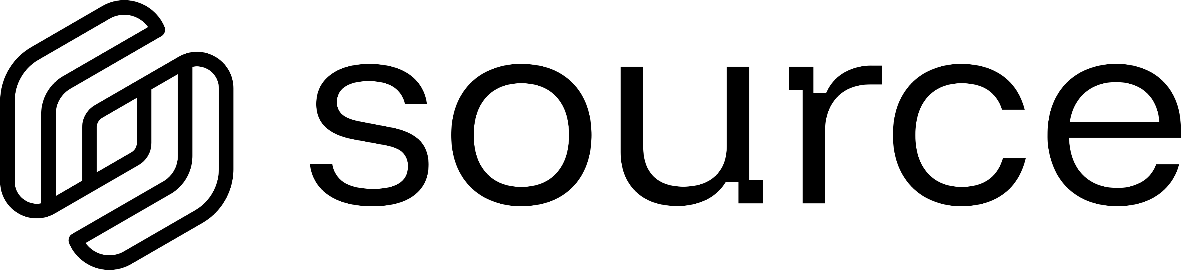
The logo is our primary identifier, combining the S symbol with the Source wordmark. It should be used as the primary representation of the brand, especially in contexts where the audience may be unfamiliar with Source.

Logo Assets
The Source logomark and horizontal lockup. Geometric hexagonal form evoking network nodes and connectivity.
Logo Lockup
Logomark Only

Product Logos
Product logos identify individual products within our ecosystem. They must always be used in their approved form and remain visually consistent with the primary brand.

 SourceHub · #0EE09E

 DefraDB · #10CBFF

 Orbis · #BFFF00

 LensVM · #FFA011
Product Icons
Identity & Color
All identity marks in their approved color applications. Use white or colored variants on dark surfaces, and black variants on light surfaces. Never swap them.
Construction
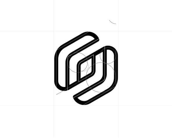
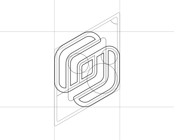
The symbol and wordmark are precisely proportioned, spaced, and aligned to function as a unified logo. Do not modify or reconstruct the logo in any way.
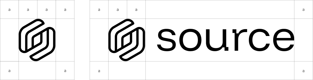
Clearspace
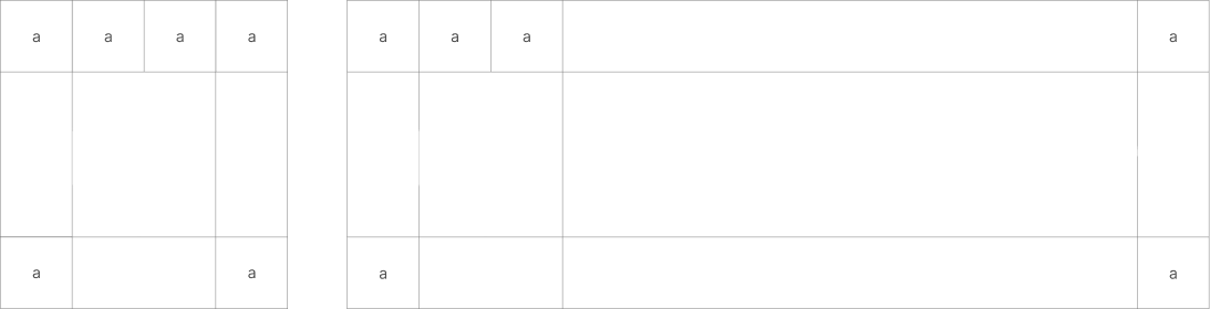
When placing surrounding elements near the identity, always allow enough space for it to remain clear and unobstructed. Use the following minimum spacing guidelines for each application.
Color Palette & Roles
The Source palette is intentionally constrained. One brand green dominates. Product accents are isolated to their contexts. Click any swatch to copy.
Core palette
The following colors make up our core palette. These tones form the foundation of the system and should be prioritized whenever the palette needs to remain focused or minimal.
RGB 6, 178, 80
CMYK 97%, 0%, 55%, 30%
RGB 57, 226, 101
CMYK 75%, 0%, 55%, 11%
RGB 255, 255, 255
CMYK 0%, 0%, 0%, 0%
RGB 0, 0, 0
CMYK 0%, 0%, 0%, 100%
RGB 11, 11, 11
CMYK 0%, 0%, 0%, 96%
RGB 34, 34, 34
CMYK 0%, 0%, 0%, 87%
RGB 229, 229, 229
CMYK 0%, 0%, 0%, 10%
Extended palette
Our extended palette reflects our varied history of color use. These values should only be used in branded materials, primarily for sub-brand color systems.
RGB 14, 224, 158
CMYK 94%, 0%, 29%, 12%
RGB 16, 203, 255
CMYK 94%, 20%, 0%, 0%
RGB 191, 255, 0
CMYK 25%, 0%, 100%, 0%
RGB 255, 160, 17
CMYK 0%, 37%, 93%, 0%
Typography
Three typefaces form the complete system. Funnel Display for headlines, Inter for body and UI, CommitMono for code.
Typefaces
Typography is one of our most important communication tools. It carries our brand voice and helps define our tone, personality, and message.
&?!.0123
&?!.0123
&?!.0123
Weights
Weight choices are intentional and limited. Funnel Display is used exclusively at 400 for a clean, editorial feel. Inter spans 300–600 to cover the full range of UI hierarchy. CommitMono stays at 400 — code needs clarity, not emphasis.
Visuals
Icons, illustrations, backgrounds, and patterns — the full visual language built on the pixel-grid motif.
Iconography
Iconography follows our signature pixel-art geometric style. Icons are simplified, structured, and consistent to ensure clarity at all sizes while reinforcing the visual language of the brand.
Icon Construction
Icon construction is based on square shapes. These shapes are grouped together and unified, then a consistent border radius is applied to the group to create the final icon form.

Illustration
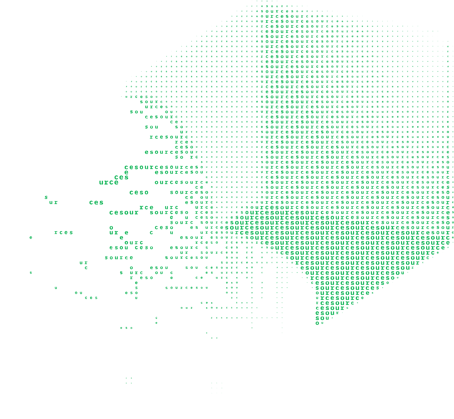
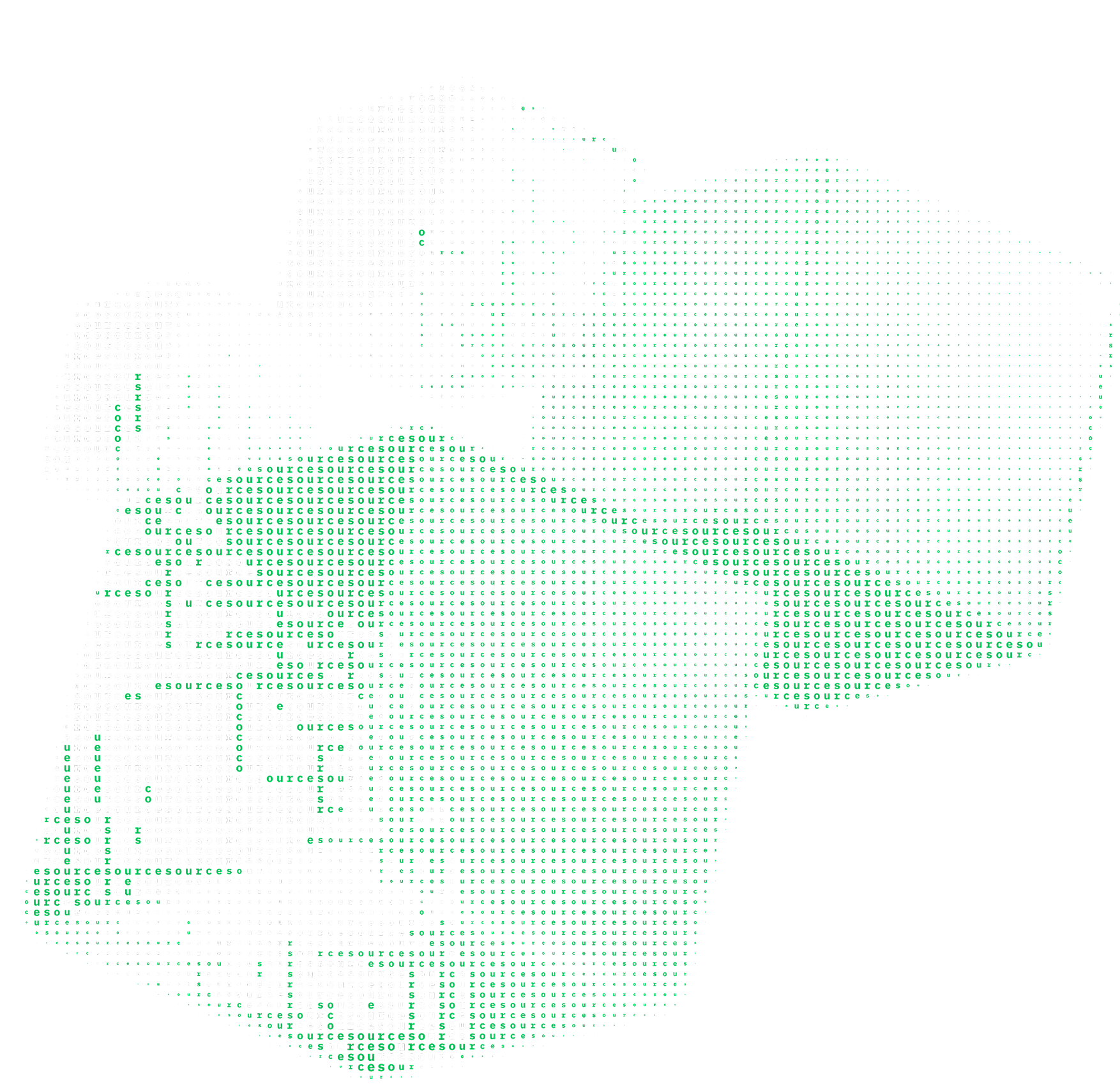
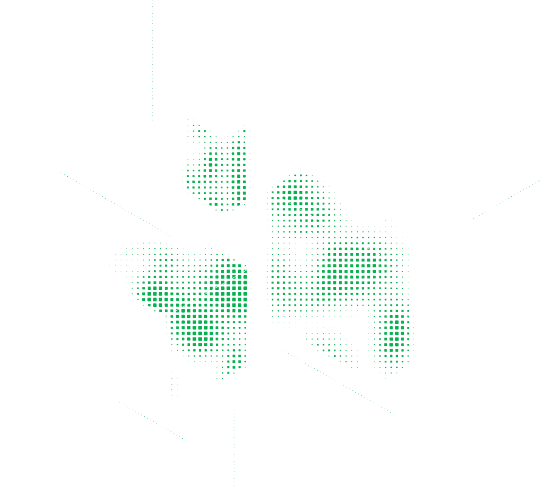
Illustrations are used to support storytelling and add clarity to complex ideas. They should feel consistent with our visual system, using simplified forms, controlled detail, and a cohesive tone that reinforces the brand without overpowering content.
Hero Illustration
T3 Illustrations
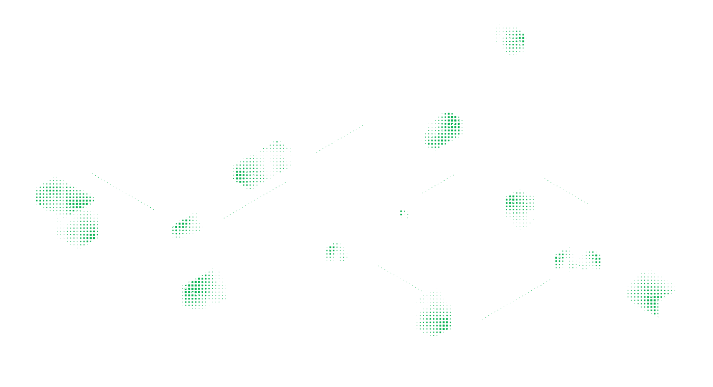
Backgrounds
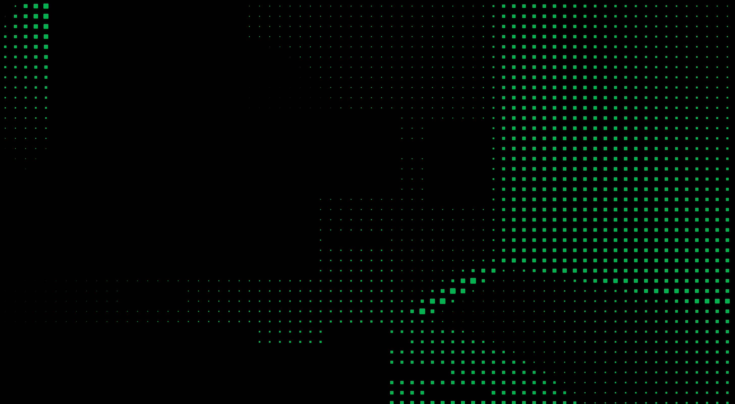
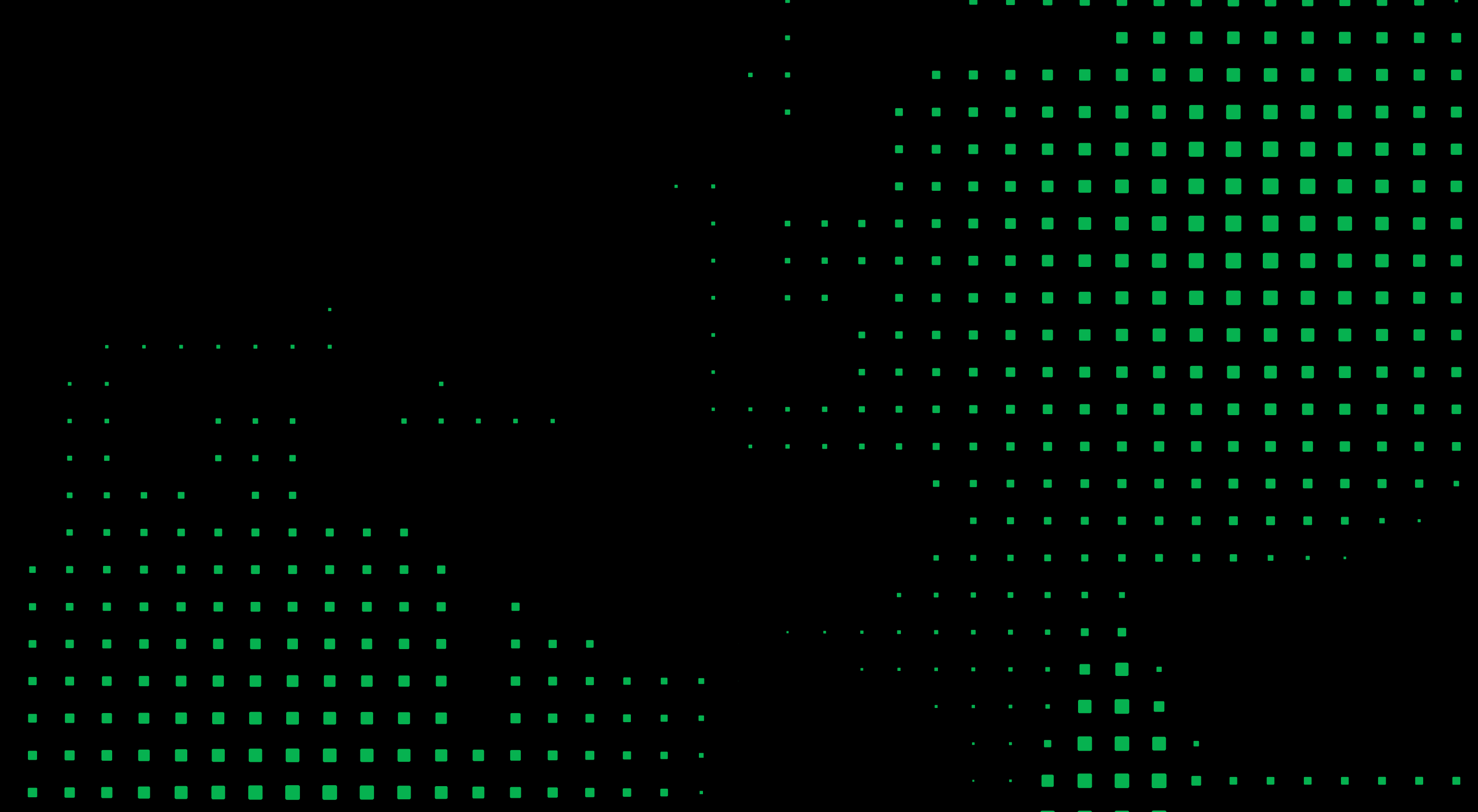
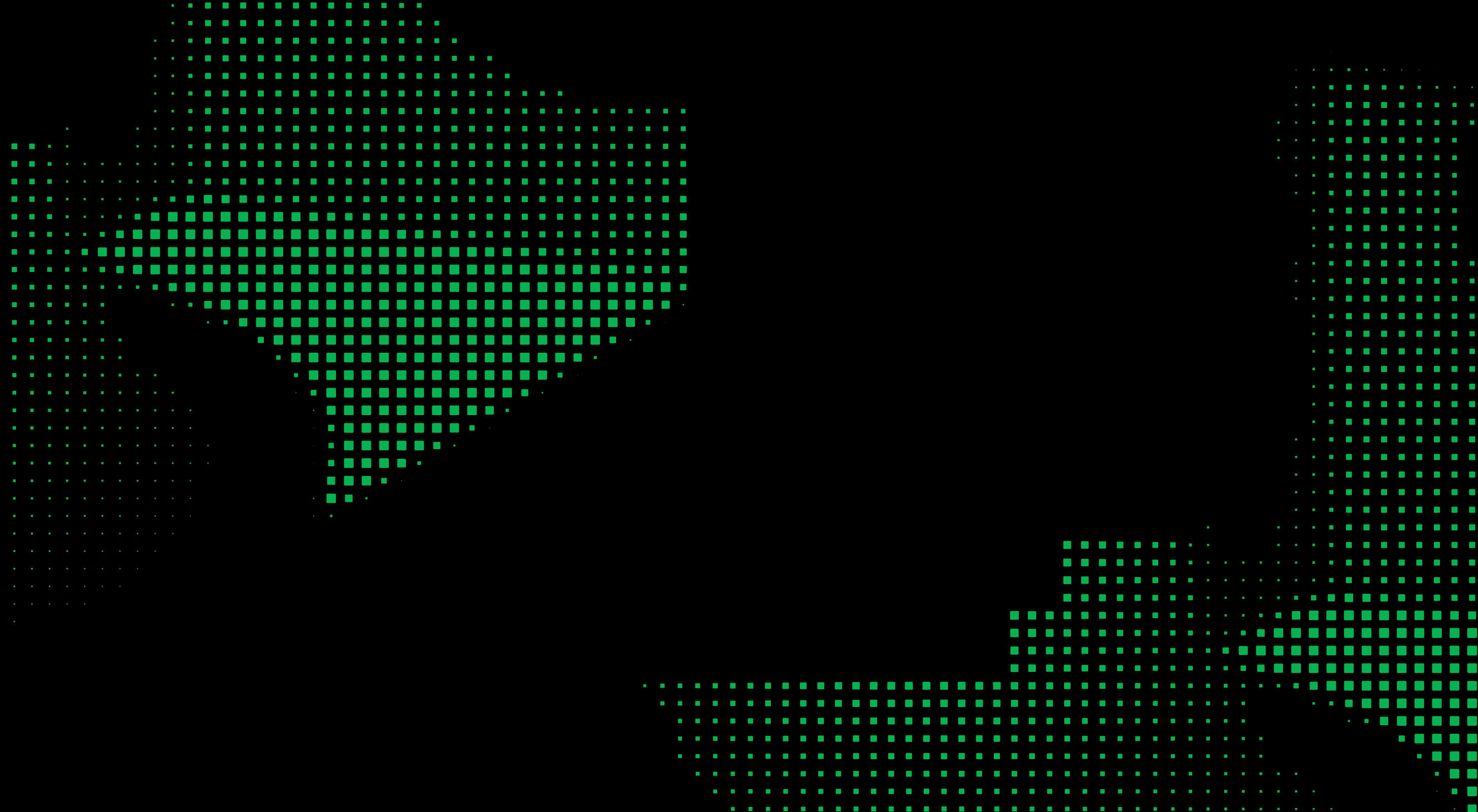

Visual Theme & Atmosphere
A developer-tools brand built on geometric precision and pixel-grid density. Flat vector, single dominant green, no gradients, no shadows.
#06B250 green with product-specific accents.Color Scales
Expanded tonal scales derived from the core palette. Each scale is anchored to a brand color — hover to see the hex, click to copy.
Type Scale
The full typographic scale across all three typefaces. Each size maps to a CSS custom property and a rem equivalent.
Component Stylings
Live, interactive component specimens showing every button, card, badge, and icon variant.
Buttons
Two primary button contexts — Brand for presentational surfaces like hero sections and landing pages, App UI for product interfaces. Secondary, ghost, and tertiary styles are shared across both contexts.
Cards
Badges & Tags
Layout Principles
8px base grid with a constrained spacing scale. Generous whitespace between sections creates breathing room.
Spacing Scale
Border Radius Scale
Depth & Elevation
Source is entirely flat. Depth is achieved through color contrast and border hierarchy, never shadows.
Do's and Don'ts
Explicit guardrails to keep designs on-brand. Follow these rules for consistent output.
-
Use
#06B250as the primary action and accent color - Pair green with black or white only — high contrast
- Use Funnel Display for headlines and brand text; Inter for everything else
- Apply negative letter-spacing at display sizes
- Keep illustrations in the pixel-dot grid style
- Use product accents only within their product context
- Keep design flat: borders and surface color, never shadows
- Don't use gradients — the brand is entirely flat
- Don't apply drop shadows or box shadows
- Don't use green for large background fills in body areas
- Don't mix product accent colors with each other
- Don't introduce colors outside the defined palette
- Don't use pill-shaped buttons for primary CTAs (use 8px radius)
Responsive Behavior
Four breakpoints govern layout collapse.
Breakpoints
| Name | Min Width | Columns | Notes |
|---|---|---|---|
| Mobile | 0px |
1 | Single column, stacked |
| Tablet | 768px |
2 | Two-column grids |
| Desktop | 1024px |
12 | Full grid layout |
| Wide | 1440px |
12 | Max content width reached |
Collapsing Strategy
| Element | Desktop | Tablet | Mobile |
|---|---|---|---|
| Navigation | Horizontal links | Horizontal links | Hamburger menu |
| Card grids | 3 columns | 2 columns | 1 column |
| Hero headline | 72px |
56px |
40px |
| Section spacing | 96px |
64px |
48px |
| Product icons | Full lockup | Full lockup | Icon only |
Agent Prompt Guide
Quick reference tables and copy-paste prompts for AI coding agents to generate on-brand UI.
Quick Color Reference
Quick Typography Reference
Example Component Prompts
Iteration Checklist
| # | Check |
|---|---|
| 1 | All colors match exact hex values — no approximations |
| 2 | Funnel Display for headlines and brand text, Inter for everything else |
| 3 | No shadows exist anywhere — depth is borders and surface color only |
| 4 | Product accent colors isolated to their respective product contexts |
| 5 | Pixel-grid / geometric aesthetic maintained in custom elements |
| 6 | All interactive elements have hover, focus, and disabled states |
| 7 | Responsive: layouts collapse correctly, type scales down, spacing reduces |